NBA 2K
A billion-dollar gaming franchise that has carved a permanent place in pop-culture. I was humbled to be part of the small, yet talented team tasked with revamping this legendary brand.
Role
Design
Art Direction
Brand Strategy
Production

The goal for the 2018 covers was to introduce a cleaner and more graphic aesthetic across the NBA2K brand. Almost a complete 180˚ from past covers, the new design is more eye catching, with brighter colors and sharper graphics. This new design was also partly introduced to increase the brand’s presence and recognition during in-store and online consumer interactions.
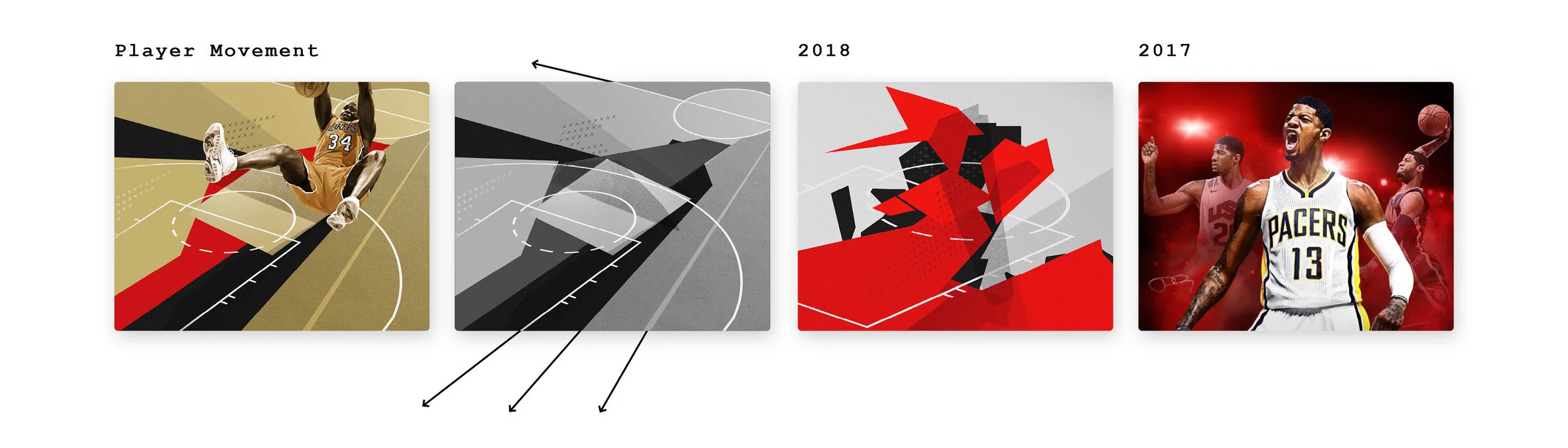
The graphics for the 2018 covers were inspired by the movements of the player and the minimal characteristics of basketball court lines. Texture was introduced to pare down the sharpness of the graphics. Photographs of the players were given an almost vintage quality to juxtapose the minimal backgrounds they were placed on.

The 2017 version of the logo read as NBA NBA 2K17. We decided to remove the characters "NBA" allowing for this truncated version to become larger, while still occupying the same horizontal footprint. Making these refinements increased visibility on in-store shelves and allowed for more flexibility across channels: social, print, and digital.
1 Logo simplified by removing the letters“NBA”
2 Official NBA logo recognition is leveraged
3 Refined gradient, more emphasis placed on parent brand
4 “K” & “1” are separated to place more emphasis on the numeral year
5 Removal of decorative strokes and gradients to simplify logo

OOH on OOH on OOH on OOH
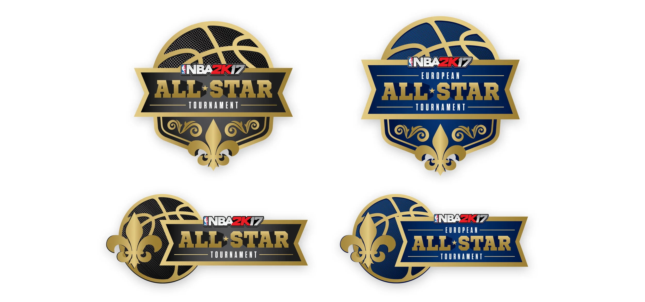
The actual 2017 NBA All-Star Game took place in New Orleans, LA. The main goal for this online NBA 2K tournament logo was to subtly reference its physical location while maintaining the brand recognition of the 2K franchise.
Credits